b-ing Interiors
Terminal Design
Dehesa Santa María, Barcelona airport
The airport is not normally where good design is a main feature, at least in Barcelona but it is certainly an area where design should be very important indeed. Firstly because it is the first and normally the lat place that visitors to the city see and spend time and secondly because it’s a place where many hours are spent waiting. This recent project for a restaurant located in T1 at Barcelona’s international airport designed by Dear Design provides an example of how a modest but well conceived intervention can improve the overall experience of airports, especially during the summer holiday period.
The main objective for this project was to create a comfortable space to spend time within the boarding area of the airport before taking long-haul flights. The over all area of the existing establishment was enlarged and the space for reorganized in order to create more fluid and intuitive access. Because the restaurant is located next to a large glass expanse overlooking the runways it was necessary to create an element of shade and played and attenuate the sunlight.
-

-

General view of the Dehesa Sana María restaurant located in Barcelona airport T1
-

The architects wanted to create an iconic space that invites the passenger to spend time, providing the restaurant with a new, fresh and different corporate image, while also communicating the idea of traditional Iberian cuisine. The first idea was to "recreate" the feeling of being in a pasture based on the play of light and shadows generated by a space which surrounds the visitor.
-

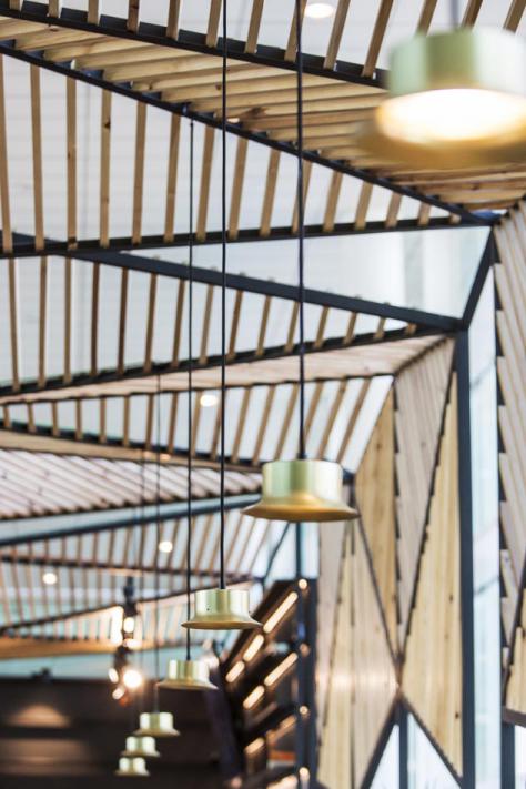
The concept is expressed within a structural skin of wooden slats, which define the space while giving it a feeling of protection. Covers and vertical dividers are made up of polygons of various shapes and sizes. This results in a dynamic and fluid space, which escapes the image of the typical pergola.
-

The furniture, chosen to give the feeling of being in a conservatory appears integrated into the whole, creating different zones within the space: bar, bench, individual and shared tables, low and high tables; create a more dynamic seating landscape. The lighting is suspended above the tables and bar counter; adjustable spotlights and integrated structural lighting help to create small-scale, more cozy areas.
-

Potted plants of different heights demarcate the spaces, while serving as a support for elements of the brand signage.
